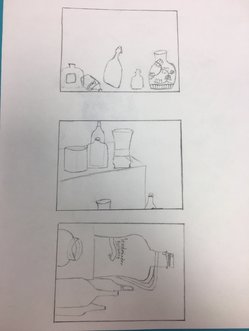
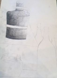
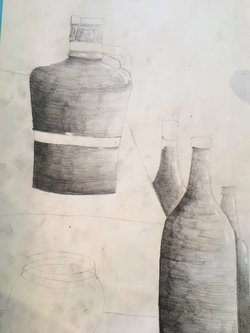
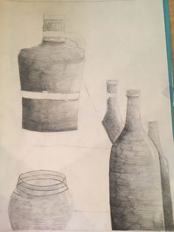
Pencil Still Life
|
|
|
|
Still Life Pencil Drawing with Value
SELF EVALUATION
1. Describe how you arranged your composition. Discuss your use of the elements and principles. Is it a successful composition?
I arranged my composition so that I could fit these five bottles on the paper in he best way possible. My only problem with this is that from my angle, it was difficult to fill the entire page with bottles, so there was more white space in the end than I would have liked.
2. Did you use a wide range of values? (A range from white to black with at least 9 values). Explain how is this evident?
I did use a wide range of values. My darks were very dark and I gradually shaded lighter as I went. The lightest shades come from the clear plastic bowl in the bottom of the composition.
3. Explain how your knowledge and creating practice studies with value contributed to your piece.
Going back to Art 1, my best piece of art (in my mind) came from a black and white pencil shading project. In that class, I learned how to use a wide range of values to shade, and that contributed to this composition.
4. Describe the blending and transitions in your objects (discuss your use of pressure with pencil and other techniques to achieve this).
I started by drawing the darkest shades in the bottom left corner of each bottle. I then shaded with the shape of the bottle, gradually getting lighter as I moved to the right. After that was done, I went back to shade any spots that looked too light.
5. Explain how your interpretation of texture is essential in capturing the look of the object.
By shading with the shape of the bottle, I was able to make the objects look more realistic to create a better outcome.
6. If you could recreate your pieces what would you do differently to enhance the final outcome?
If I could recreate my piece, I would add folds of cloth and try to find a better way to fill in the white space on the paper.
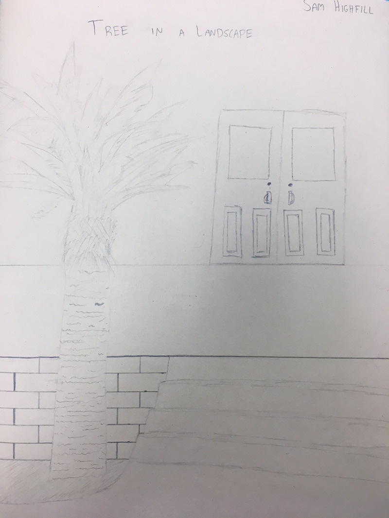
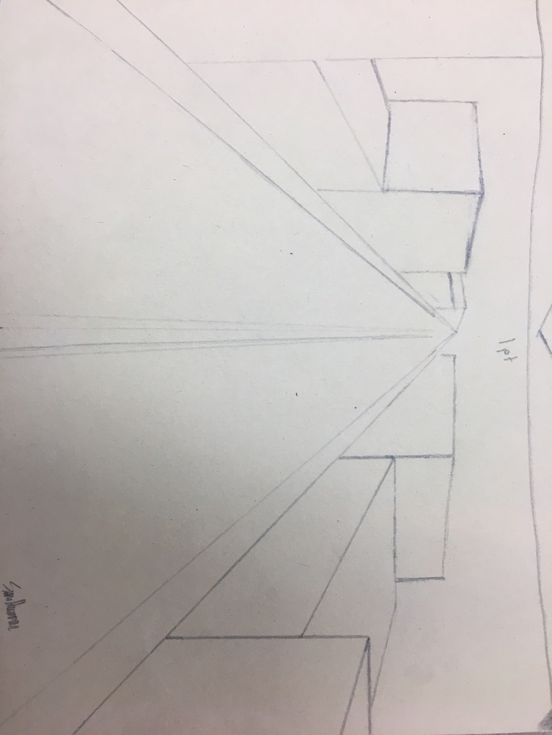
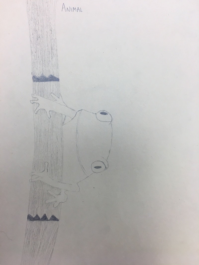
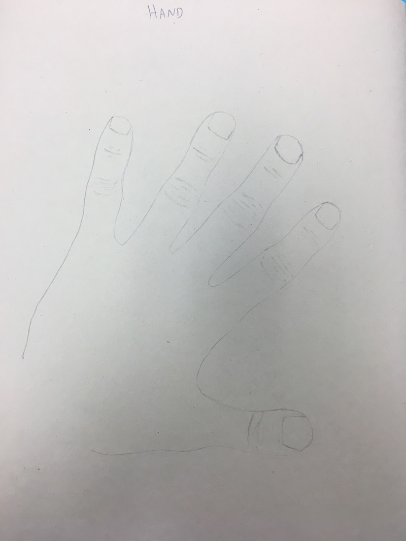
4 Drawings
For our first project, we were supposed to draw four things: A tree in a landscape, an animal, 1 point perspective from a street view, and a hand.
|
|
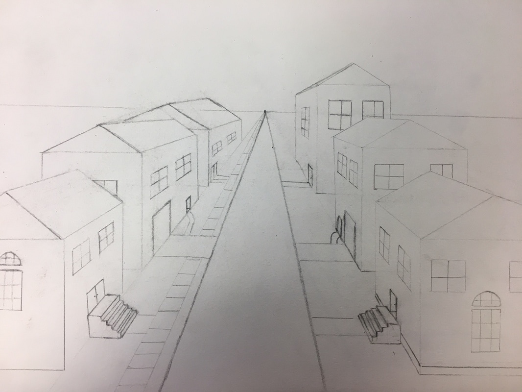
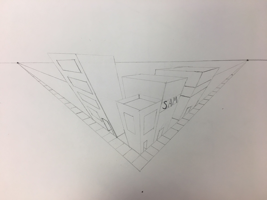
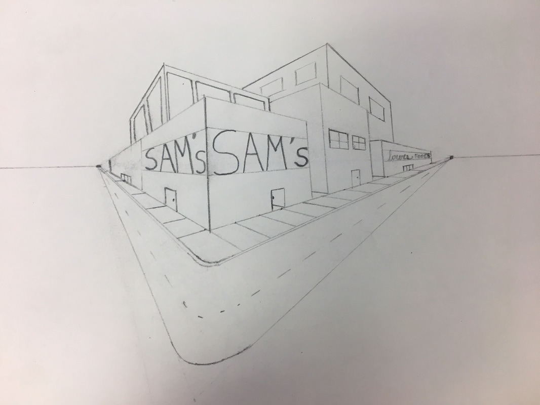
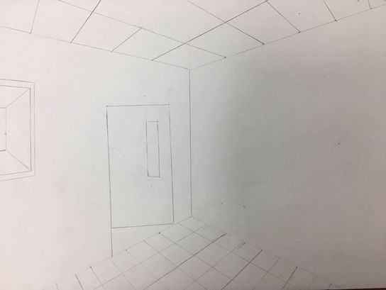
Perspective Drawings
I drew a street of houses for 1 point perspective, a street view for 2 and 3 point perspective, and drew the corner of the art room by the door in 2 point perspective.
|
|
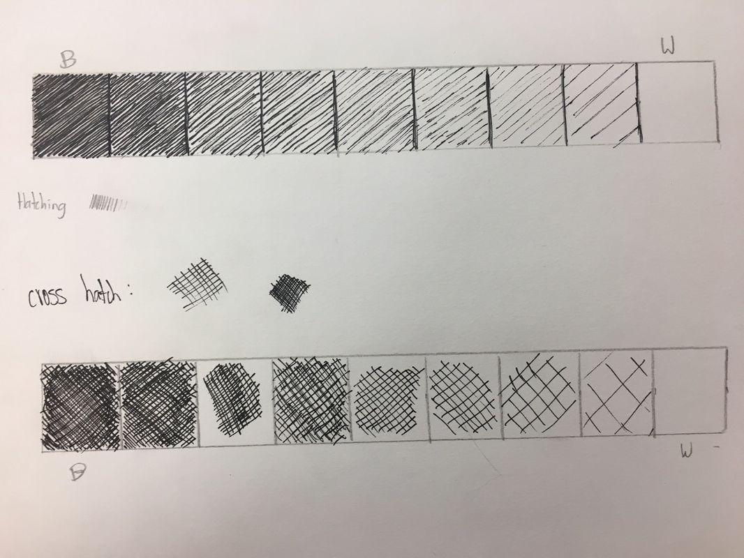
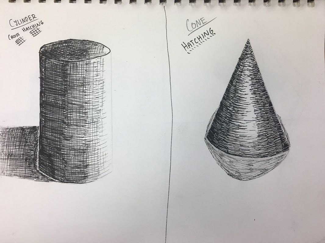
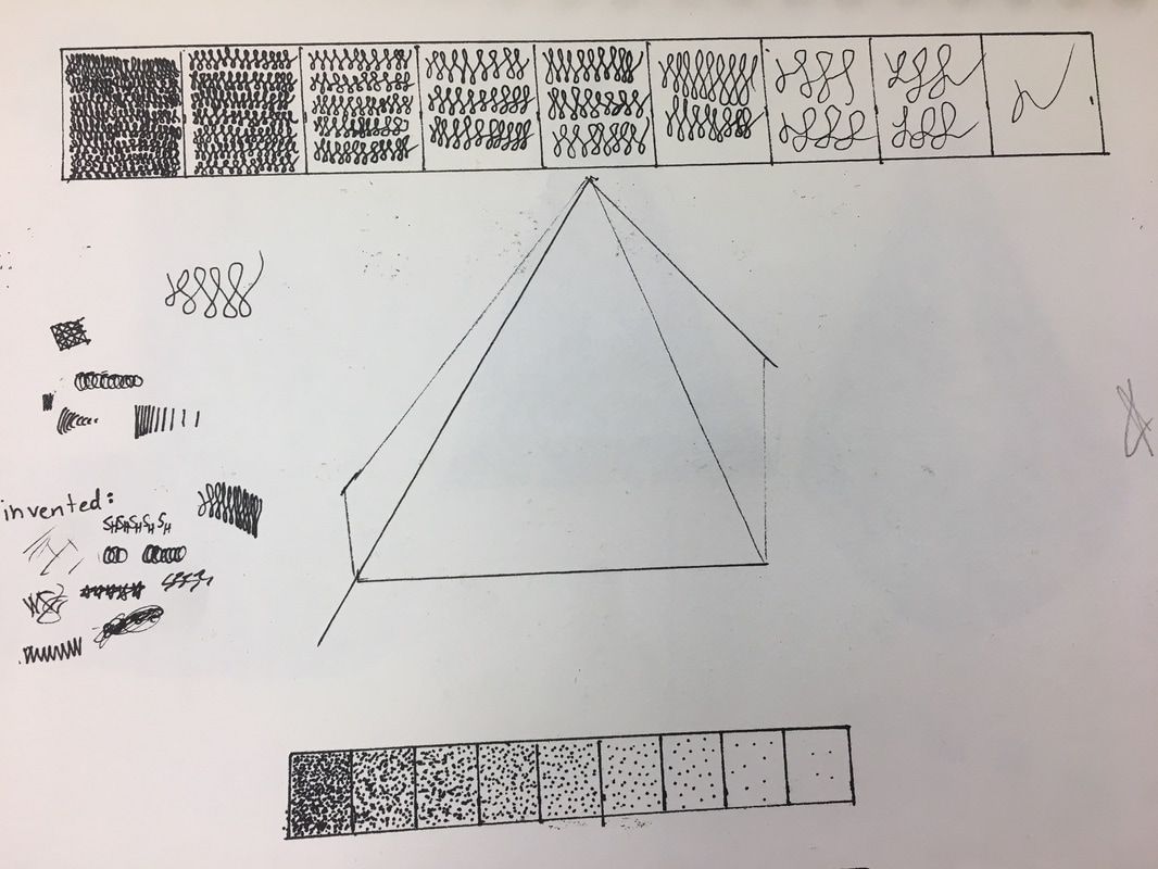
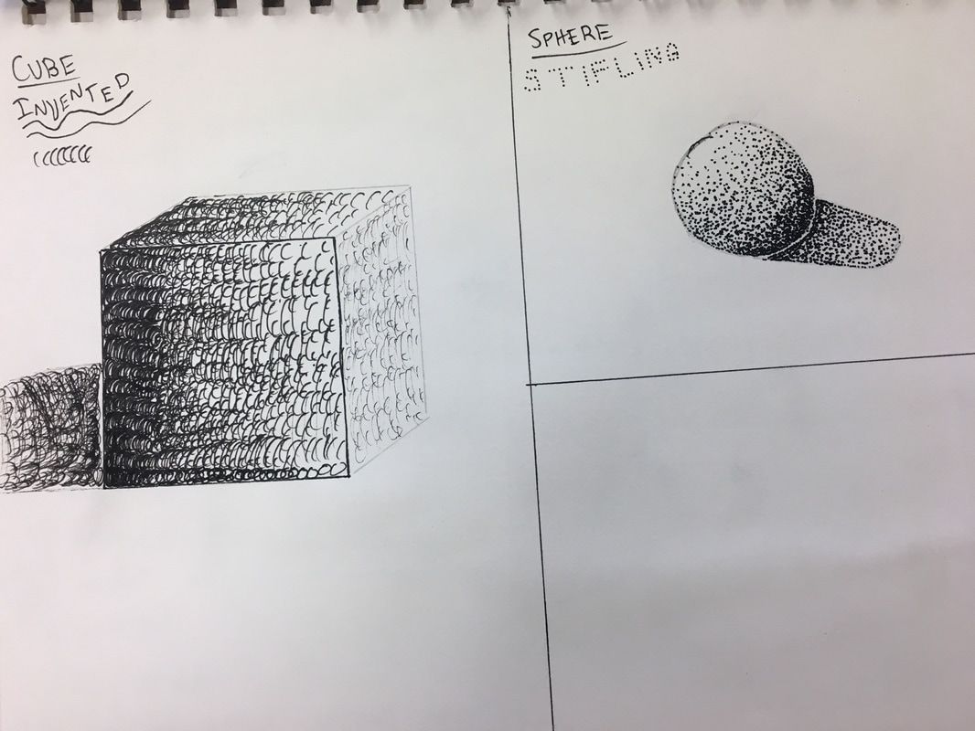
Pen & Ink
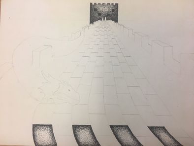
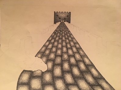
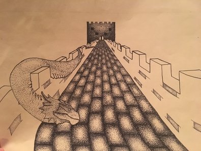
I created a pen and ink value chart using hatching, cross hatching, invented, and stifling. Then I used each of these to draw 3D Shapes. I used cross hatching to draw the cylinder, hatching to draw a cone, invented for the cube, and stifling to draw a sphere.
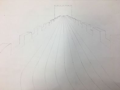
Pen & Ink Final1. Discuss your decision on pen and ink techniques. Why you chose to use one or more. I used stifling for this entire piece because after testing all four techniques, stifling definitely looked best for drawing bricks. 2. How did you use perspective? Why is perspective important? I used perspective to show the path of the Great Wall of China going off into the distance and then a castle-like building far away. Perspective is important because it shows depth and adds a focus to the piece. 3. How is texture important in your composition? The main texture in my piece is the stifling on the bricks, which shows the shadows and the textures of the bricks well. 4. Why is value so important in this project? A wide range of values is very important to show where the sun is hitting the objects in the piece. 5. Describe your craftsmanship (How well the project is crafted technically) I think I did a really good job on the bricks and the castle, but the dragon and the sides of the walls could use more work. Part of the problem I ran into was that stifling is a very time consuming method, so I tried to find ways to make the piece look good without taking way too long. 6. If you could recreate your piece what would you do differently to enhance your final outcome? If I could recreate my piece, I would see If I could use multiple techniques to make it look more realistic, and I would make the bricks darker as they get farther away. This would allow me to create better shadows, especially for the dragon. 7. When applying the pen and ink techniques why and how is it important to make sure you understand the concepts taught in class? You must understand the concepts taught in class because it will help to enhance your piece, and you will be able to determine what technique would work best for your piece. 8. As a growing artist how do you think what you have learned will guide and better your future projects. I have learned that pen and ink is not easy, but with practice I got much better at it. I can use this with just about any medium, and my art pieces will begin to look even better. |
|
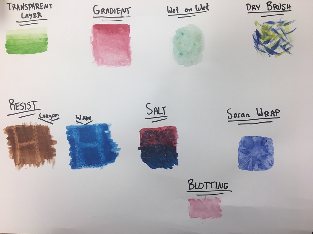
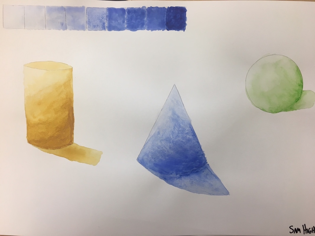
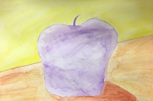
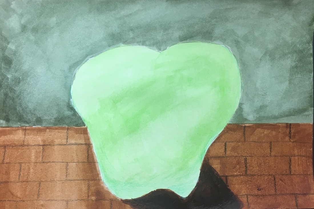
Watercolor Techniques
We learned about 8 different watercolor techniques, and then used a few of them to paint 3D shapes. I also created a value chart using blue watercolor paint.
|
|
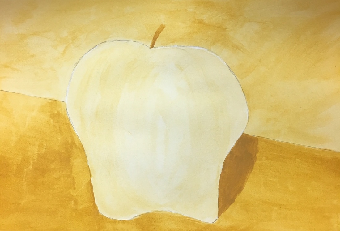
Watercolor Apples
I used different watercolor techniques to paint four apples. The first is composed of all cool colors; the second is composed from watercolor pencil that I then added water to; the third apple is is a monochromatic mustard yellow theme; and the fourth is watercolor enhanced with colored pencil.
|
|
Prismacolor spheres
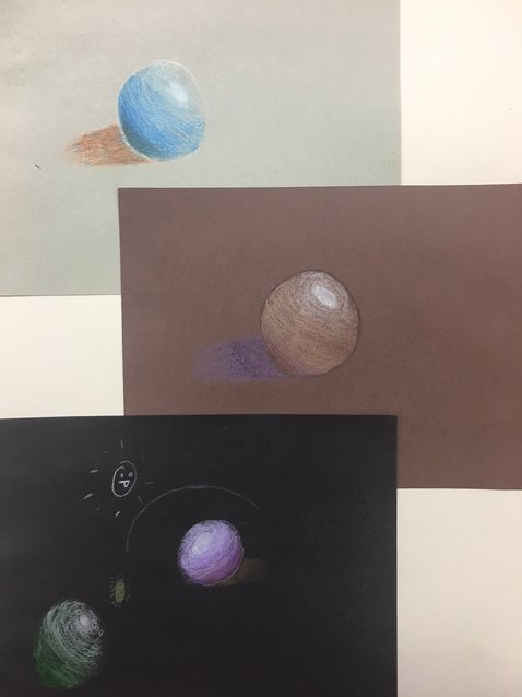
I shaded three different spheres- one on each color of paper. I started each by shading with a "medium" color, then went in with white, and finished by adding a darker shade and a shadow.
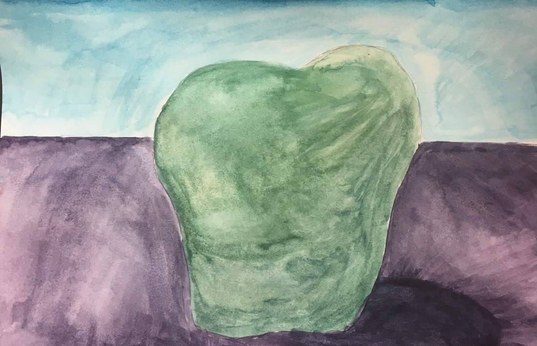
Prismacolor Fruit
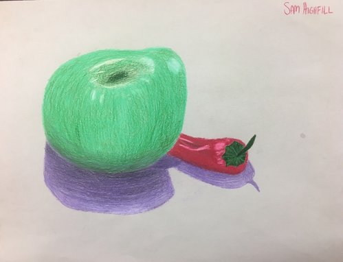
I used the prismacolor shading techniques that I learned when drawing spheres to draw an apple and a pepper.
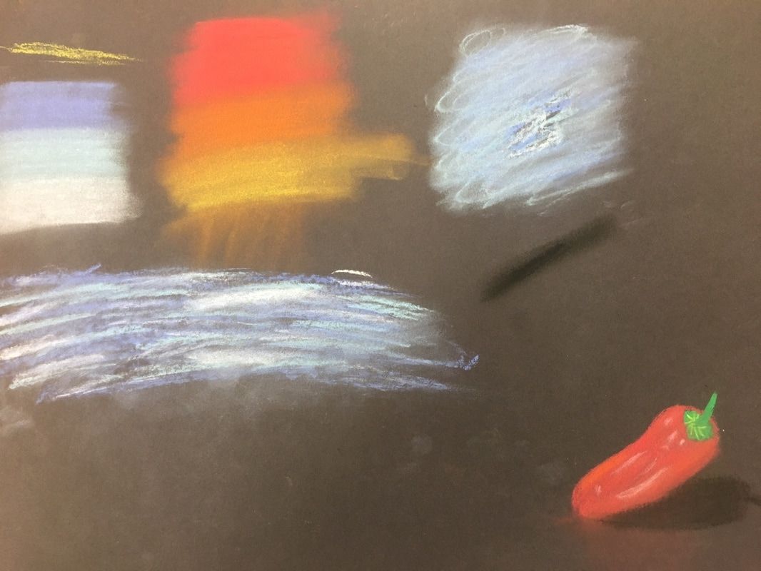
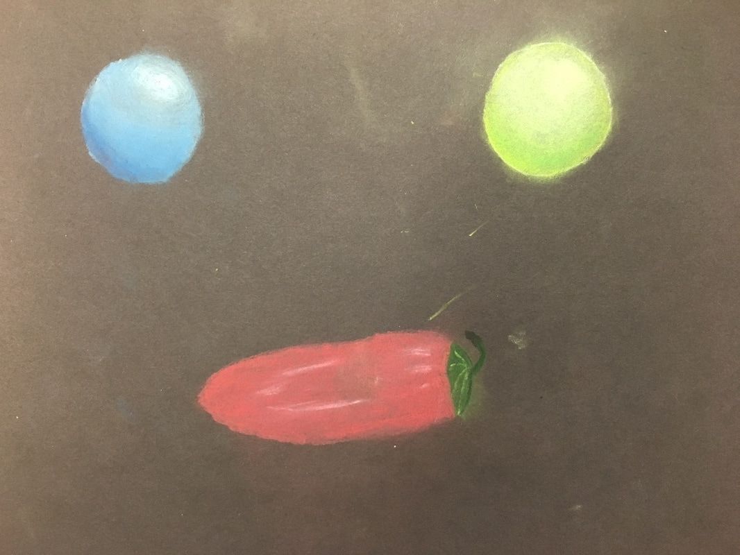
Pastel
We went over different techniques in class, including gradients and how to blend pastels. I used these techniques to draw spheres and peppers using just pastels and pastel pencils.
|
|
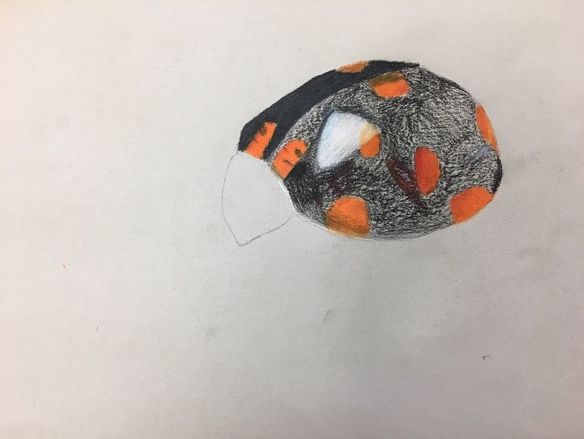
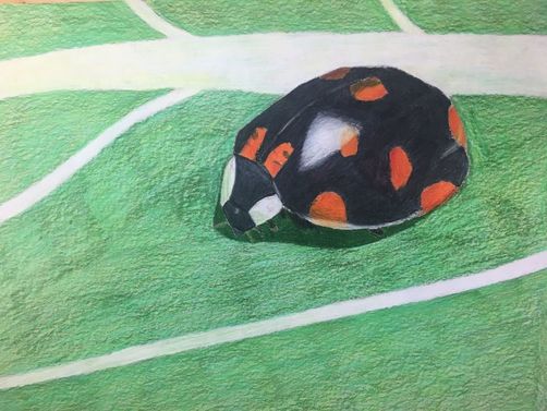
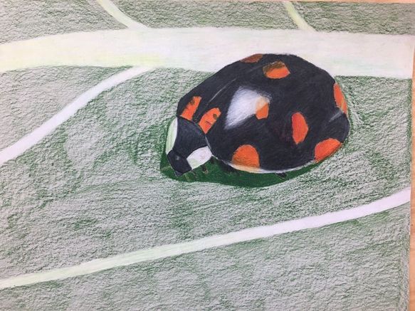
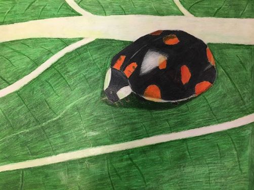
O’Keeffe Inspired Drawing
|
|
1. Describe the craftsmanship of your drawing. (Is it neat and well executed?)
I feel like I did a good job with the craftsmanship of this drawing. I believe I added a lot of texture to my drawing in the darker lines and highlights.
2. Do you think you used a full range of values to create the illusion of depth?
I don’t think I used a full range of values, but I layered the piece using multiple greens and yellows, and red, orange, and yellow for the spot on the ladybug. I used black to show the darkest spots of the bug and white to show highlights, so I think I used a pretty wide range of values.
3. How do you think you represented the style of the artist Georgia O’ Keeffe?
I think I created a piece that isn’t too much different from her style of art. My drawing is a close-up of nature, which is exactly what she loved to paint.
4. Describe your choice of colors/color harmonies and how you used them throughout the artwork.
I looked for every color I could find in my reference photo. The ladybug is mainly black, but I added white to show highlights and make the shell look shinier. In the leaves, I saw mainly green but also some yellows and whites. I layered with a light green, dark green, and yellow two times each, and then added the whites in last. Overall, I think all of the colors work well together in the piece.
5. How did you create contrast in your drawing?
There is a contrast to begin with in the black ladybug and the lighter colored leaves. I added more contrast by adding a dark shadow beneath the bug.
6. How did you use textures, highlights and shadows to enhance your artwork?
I drew a shadow under the bug to make it look more realistic, and added highlights to where the light was hitting the bug or the leaf. I finished the piece by adding texture to the leaf by drawing in darker lines similar to where I saw them in my reference photo.
7. Describe any difficulties you had creating your drawing and what you could do to improve your drawing?
I had the most trouble drawing in the legs of the bug. They turned out fine, but next time I would draw those in pencil before going straight to prismacolor. I would also try to add more yellow into the leaves because it gets overshadowed by the darker green.
Paint Color Wheel
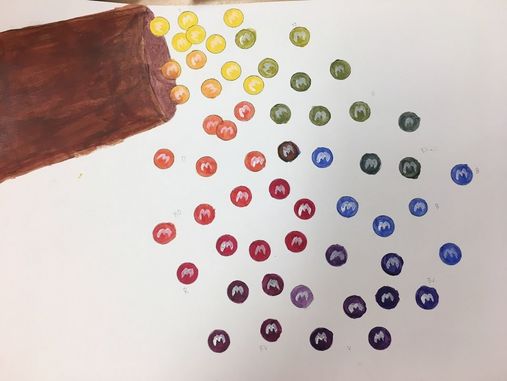
I had the idea of using M&M's pouring out of the bag to create a color wheel. I used 13 colors- the primary, secondary, and tertiary plus brown for the bag and in the middle.
Section Painting
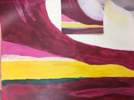
I used my little piece of paper and tried to mix colors to make my painting look as close to the section painting as possible.
Value Chart
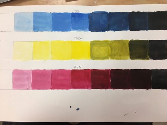
I created a value chart for each of the three primary colors- blue, yellow, and red.
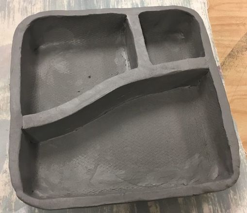
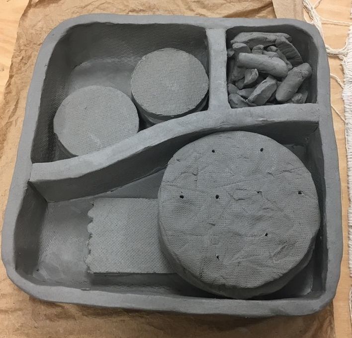
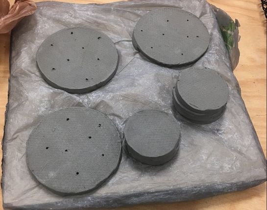
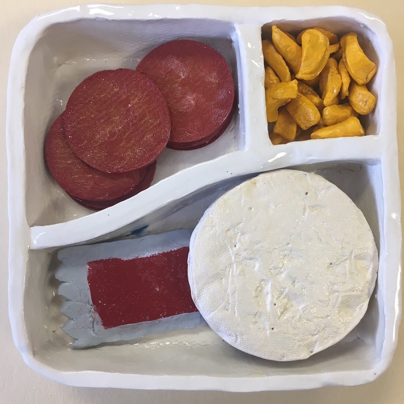
Clay Food
1. Describe the craftsmanship of your sculpture. (Is it neat and well executed?)
I think I did a good job executing this project. The container is really neat and looks like a Lunchable. I like the cheese, which I created by peeling the clay, and the pepperoni is neat and has texture to it. I also really like the texture that I used on the pizza bread.
2. What was the most difficult part of this project?
The most difficult part of this project was creating the container. I started by rolling out a large slab of clay, then cut it into a square. I then had to fold up the sides and then add the walls inside the container by scoring and slipping.
3. Did your color choices work together harmoniously?
I feel like my color choices work well and reflect what a Lunchable really looks like.
4. Is your sculpture interesting from all views?
I believe it is interesting from all views. You can see all of the components and colors from wherever you look, and it looks really neat.
5. Describe the differences in constructing a sculpture and doing something 2D.
Constructing a sculpture is different from doing something 2D because in a sculpture, you have to think about more aspects- how it looks from all angles and how to construct different pieces top go together. For me, it is easier to add texture to clay than to a painting.
6. How did you create textures in your sculpture?
I used the bottom of a clay tool to create texture in the pepperoni, and used a different clay tool to “peel” cheese. To create texture on the pizzas, I used a rock.
7. Does your sculpture look like the actual food? How did you accomplish this?
I feel like my pepperoni and cheese both look real, but it was difficult for me to create red sauce in a clear bag, and I don’t love the color of the pizzas.
8. What would you do differently if you were to do this project again?
Overall, I wouldn’t change much. I would work more of the craftsmanship of my container, and I might try to find a better way to recreate the red sauce packet.
|
|
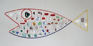
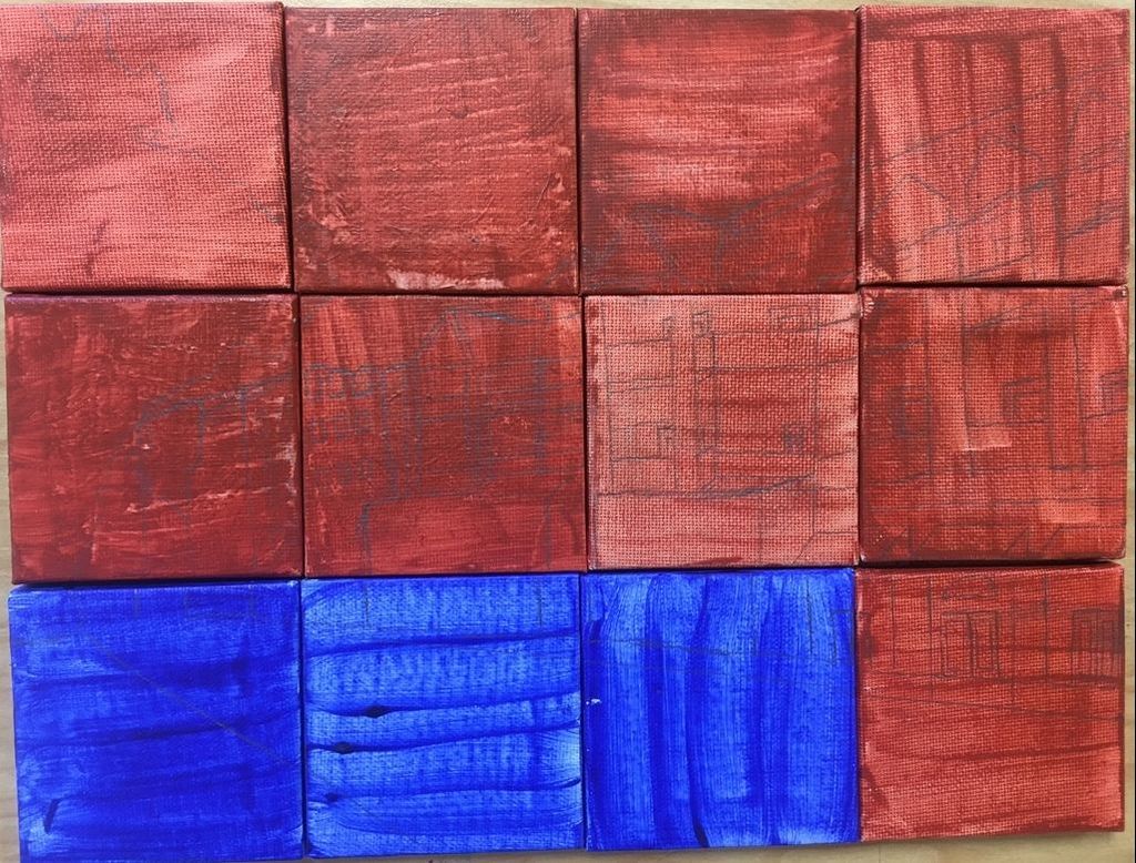
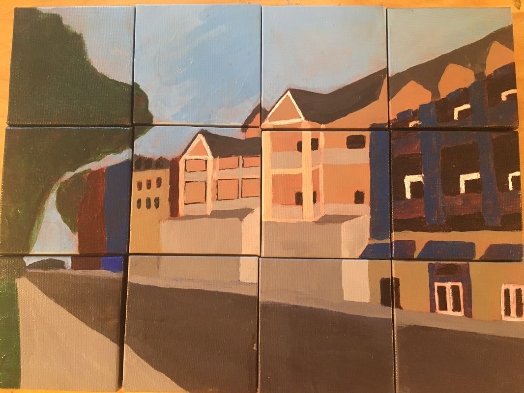
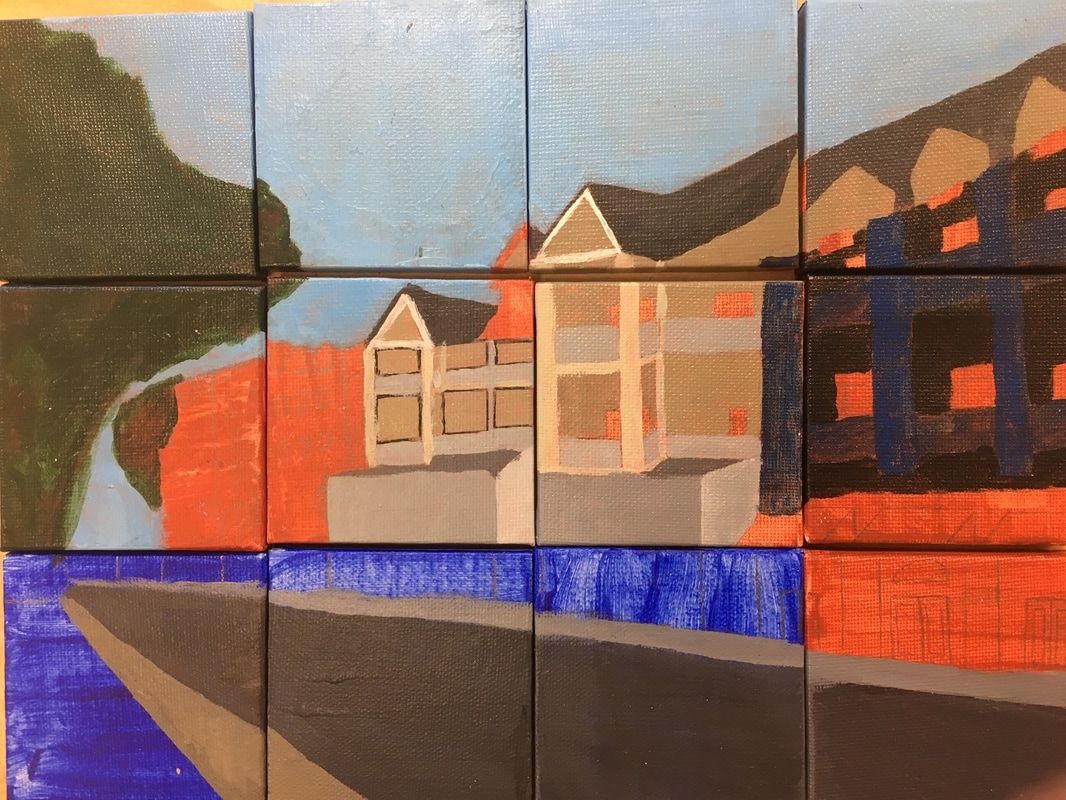
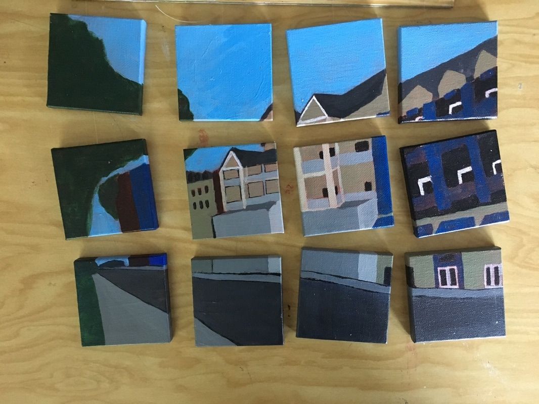
Landscape in style of Alexander Calder
|
Left: Alexander Calder's mobile, using different objects and wires to create a fish sculpture.
|
- Who was your referenced artist for the painting? Name 4 main ideas you used from your research to create your painting.
a. Mobile sculpture
b. Barely any mixing in his paintings.
c. Use objects to create a sculpture of an animal (fish, bird)
d. Mini canvases hung to show movement
2. Describe the craftsmanship of your painting. (Is it neat and well executed?)
My painting is fairly neat and I think I did a decent job of executing. I painted in my own style because the main focus is how the pieces move when they are hung. This creates movement in the painting which is what Calder loved to do.
3. What was the most difficult part of this project?
The most difficult part for me was the actual painting part. My artist did not paint much, so I didn’t really have a style to create while I was painting each canvas. It was also very difficult to add much detail on such a small canvas.
4. Describe your color choices and how they reflect the work of your chosen artist?
In Alexander Calder’s paintings, there is barely any blending of colors, so I chose not to really blend colors in my painting. He used mainly vibrant colors, so I think I could have done a better job using those.
5. What do you think your chosen artist would say if he or she could see your painting today?
The style of my landscape is unique in that I used 12 smaller canvases to create one larger painting. I then hung them from a stick to create movement in each canvas to look similar to a sculpture, which is most of what Calder did.
6. What would you do differently if you were to do this project again?
If I were to do this project again, I would use more vibrant colors in my painting to better reflect my artist. I would also try to add more detail and be more careful when painting in really small areas.
